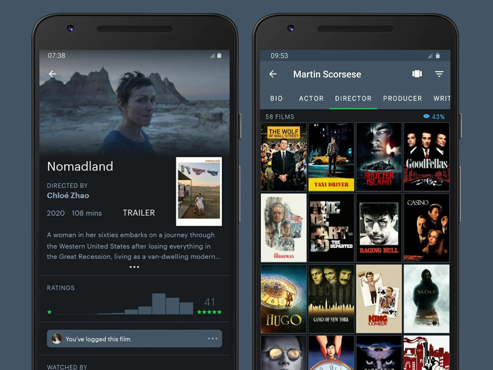
Problem
Goodreads is the most widely used book tracking and discovery app, but its UX feels outdated and unintuitive. Users struggle with navigation, scattered features, and unclear priorities (is it for tracking, discovering, or connecting?).
Goal
Redesign the information architecture (IA) to simplify navigation, align with user mental models, and improve discoverability.
Research
Heuristic evaluation: Identify pain points (hamburger overload, scattered shelves, redundant menus).
Competitive analysis: Compare with apps like StoryGraph, Letterboxd, and Spotify for inspiration.
User feedback (from reviews & forums): Common frustrations include hard-to-find features, confusing progress updates, and cluttered feeds.
Users — Challenges and Goals
Who they are:
Avid readers (Wants to track and rate books quickly).
Casual readers (Wants recommendations without too much navigation).
What they do:
Track reading, find books, share reviews, rate, connect with others.
Goals:
Quickly find books.
Track reading progress efficiently.
Connect with like-minded readers.
These two personas clearly justify the need of a redesign of the Informational Architecture of the app.
Emma (avid) → needs centralized shelves, visible progress/stats, and a streamlined social layer.
Alex (casual) → needs simplified discovery, fewer menus, and easier access to recommendations.
Key Problems Identified
1. Lack of Clear Hierarchy
Core actions (search, add a book, update progress) require too many taps.
Shelves — the backbone of Goodreads — are not central in the IA.
2. Redundant & Confusing Discovery Flows
Users can browse, search, check recommendations, or explore lists - but these are split into separate sections with overlapping purposes.
This fragmentation makes book discovery less efficient and adds unnecessary complexity.
3. Inconsistency across screens
The search bar is not consistently placed across screens: sometimes in the header, sometimes hidden behind an icon, sometimes absent altogether.
This breaks the user’s mental model - search should feel like a global action, not a contextual one.
It adds friction: users can’t rely on muscle memory to find books quickly.
Key Problems Identified
4. Poor Integration of Progress & Stats
Reading progress, streaks, and goals are buried in challenges instead of being surfaced in the main experience.
Stats feel like an afterthought rather than a motivating, central feature.
5. Web-first layout
The app feels like a port of the desktop website, not optimized for mobile flows.
Key Problems Identified
6. Overloaded hamburger menu
Too many buried options (challenges, groups, friends, quotes, etc.).
Low discoverability — users often don’t know certain features exist.
7. Hidden & Overloaded “+” Button
The “+” button is not prominent, so many users don’t notice it.
It mixes unrelated actions: Search, Scan a Book, Add Amazon Books, Recommendations, Create a Shelf/Tag.
This breaks the principle of clarity → users can’t form a mental model of what the button does.
Important actions like Add Book get buried among secondary ones.
Improve the Information Architecture
It will reduce friction for new users, highlight community features to drive user interaction and improve engagement and retention.
Impact of the New Information Architecture
Reduce friction for new users
Clearer navigation hierarchy → no confusion between Library, My Books, and Shelves.
Core actions (search, add a book, update progress) surfaced upfront → faster onboarding.
Highlight community features
Groups, Discussions, and Friends’ Updates are no longer buried → more visibility drives interaction.
Book clubs and challenges are made central → encourages participation.
Improve engagement and retention
Easier tracking and progress updates → users keep coming back.
More personalized discovery flows (Recommendations, New Releases, Shop Your List) → less redundancy, more relevance.
Community engagement + smooth tracking loop = stickiness over time.
Key Improvements
1.Clearer Top-Level Structure
Move from a cluttered hamburger menu to 5 clear parent categories: Home · Discover · My Library · Community · Profile
> This matches how users naturally think: read now → find books → track books → connect → see self
2. Unified Discovery Experience
Combine Search, Browse, Recommendations, New Releases, Giveaways, Shop into one Discover tab.
> Reduces redundancy and cognitive load (no more guessing where to find a book).
3. Prioritize Core Actions
Quick access to update progress from Currently Reading card on Home/Shelves.
Make the FAB persistent and clearly visible across key screens (Home, Discover, My Library).
Limit the FAB to book-related entry actions only:
Scan ISBN / Barcode
Search Book
Manual Entry
Move unrelated actions (Recommendations, Create Shelf/Tag, Import Amazon Books) to their proper sections:
Recommendations → inside Discover
Shelves/Tags → inside My Library
Amazon Books → under Settings or Integrations
Key Improvements
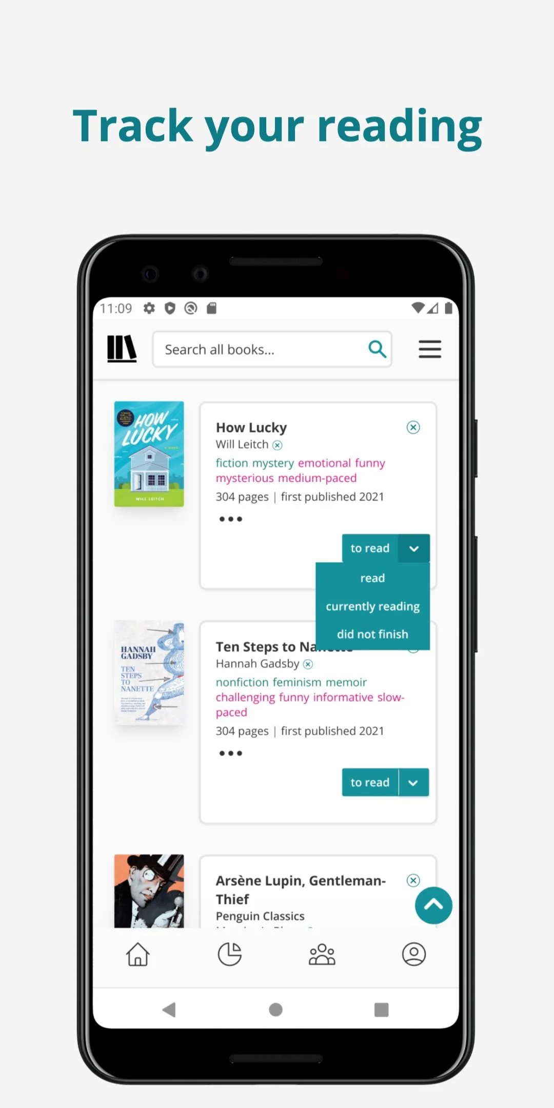
4. Shelves as the Backbone
Predefined shelves (Want to Read, Currently Reading, Read) stay consistent.
Custom shelves (tags) organized in the same place.
> This makes My Library the central hub instead of scattering books across different menus.
5. Separation of Social Layer
Friends’ updates, groups, book clubs, quotes, and challenges moved under Community.
> Keeps social features discoverable without cluttering book tracking
6. Better Progress & Motivation
Progress, streaks, stats, and goals integrated in Home + My Library, instead of hidden in challenges.
> Makes reading achievements more visible and motivating.
7. Progressive Disclosure for Secondary Features
Less-frequent features (settings, account management, author Q&A, quotes) placed deeper in hierarchy.
> Prevents main navigation from being overloaded.
Overall Benefits
Simplified navigation → fewer taps to reach core actions.
Better mental model → users immediately know where to go (track, discover, connect).
Reduced redundancy → eliminates overlap between shelves, challenges, and stats.
More engaging → by surfacing progress, streaks, and friend highlights upfront.
Impact
Easier to use, especially for casual readers.
Higher engagement with discovery and challenges.
Clearer value proposition for Goodreads: “Track your reading, discover new books, and connect with other readers — all in one place.”
Conclusion
Restructuring Goodreads’ information architecture directly addresses the app’s biggest usability challenges. By reducing overloaded navigation, centralizing shelves as the backbone of the experience, and unifying discovery flows, the new IA creates a clearer mental model for users: track your books, discover new reads, and connect with the community. Core actions like search, adding a book, and updating progress are now surfaced upfront, while secondary features are available through progressive disclosure without cluttering the main navigation.
This simplified structure not only makes Goodreads more intuitive for new users but also more engaging for experienced readers who want to track progress, explore recommendations, and stay connected.
Next Steps
Usability Testing → validate whether users can complete key tasks (add a book, join a group, track progress) faster and with less confusion.
Accessibility Audits → ensure that new navigation and layouts are screen reader–friendly, support dynamic font sizes, and meet contrast guidelines.
Iterative Feedback → gather insights from both casual readers and power users to refine the hierarchy further.
More Projects
-
![A screenshot of a mental health app dashboard on a computer with a sidebar menu, displaying session updates, goals, challenges, key updates, skills, assessments, and progress in therapeutic concepts. On the left, a mobile phone screen shows a conversation with Sofia, an AI assistant, greeting Michael and asking about his feelings, with a text input field at the bottom.]()
Sentur Recovery
App | Dashboards | Brand Design | Social Media
-
![My Dictionary]()
My Dictionary
App | User Testing | Prototype
-
![Three smartphone screens displaying a mental health and self-care app interface. The screens show various features including a greeting message, journey plans, meditation courses, a network diagram of emotional states, and personalized content related to stress and internalized homophobia.]()
Sentur
App | Research | Brand
-
![Screenshots of a mobile healthcare app showing a doctor search page, appointment scheduling, and a doctor profile for Dr. Maria Ivanova, a heart surgeon.]()
DocFind
App | Research | Prototype
-
![Screenshots of an online banking app in Bulgarian, showing options for withdrawal, deposit, changing PIN, balance inquiry, and others; includes PIN entry, deposit confirmation, and transaction amount input screens.]()
EasyPay
ATM | Animations | Research
-
![Three smartphones displaying different screens of social media and branding content for Sentur, a healthcare company, with a central woman jumping outdoors and text that says "Tailor your approach to each individual's needs."]()
Sentur Recovery Brand
Brand Design | Social Media
-
![Four smartphone screens showing a music or event app interface including login, genre selection, search results with images of concerts, and event details with location map.]()
ConcertHub
App | Research | Prototype
-
![Laptop and smartphone screens displaying Coca-Cola promotional websites, featuring contests, recipes, and product images in a red, black, and white theme.]()
Coke & Meals
App | Web Design | Promo Engine
-
![Graphic showing a UX case study presentation for Goodreads, including multiple mobile phone screens displaying different views of the Goodreads app interface, with a title and a label indicating it's a UX case study.]()
Goodreads
Case Study | UX | Research | Wireframes
-
![]()
Hiker
Bulgarian Hiking App
-
![]()
Conversion Landing Page
Redesign | Research | Web & App