Sentur Recovery
Type: Brand Identity & Graphic Design
Role: Graphic Designer, Visual Strategist
My Role as a Designer
I led the visual concept, graphic system development, and brand applications across platforms. From defining tone to shaping emotional response through design, this project reflects my approach: graphic design as mindful storytelling.
Project Overview
Sentur Recovery is platform supporting emotional healing through Internal Family Systems (IFS) therapy. My role was to craft a cohesive, emotionally resonant visual identity and brand system that would serve as the foundation for the company’s marketing, communications, and user engagement efforts.
Design a brand that feels safe, modern, and human, making therapy more approachable while maintaining a strong and trustworthy presence across platforms.
The Goal
Branding Strategy – Design with Emotion
The brand identity was developed with a strong emotional and psychological foundation:
Core Values: Safety, Self-awareness, Growth, Wholeness
Brand Personality: Gentle, Empathetic, Modern
Audience: Adults in recovery or emotional healing, therapists, clinicians
To visually reflect the layered inner world of IFS therapy, the identity uses:
Soft geometric shapes to represent the “parts” within us
Muted earth tones & gradients to evoke calmness and depth
Rounded, friendly typefaces that feel inclusive and non-clinical
Clean compositions with space to mirror the clarity of self-awareness

Brand Archetype – The Sage
The Sage archetype is driven by insight, clarity, and self-knowledge. Sentur’s brand needed to express:
Wisdom without arrogance
Guidance without control
Clarity without coldness
To balance this, I blended:
Modern tech minimalism (for AI-driven features)
Symbolism and depth (for therapeutic meaning)
Color psychology through purple, representing intuition, inner wisdom, and transformation
Why I Combined Purple and Green
The combination of these two colors visually captures the essence of Sentur Recovery’s brand: a space where wisdom meets growth, and technology meets healing.
Purple #681ADB – Intuition, Tech and Inner Depth
This rich, saturated purple expresses:
The Sage archetype – representing knowledge, insight, and inner clarity
Therapeutic transformation – depth of thought, self-reflection, and emotional intelligence
Tech-forward identity – aligning with AI-enhanced therapy tools and modernity
It’s used as the core identity color to convey emotional sophistication and spiritual strength.
Green #8DAC5B – Growth, Healing, and Grounding
This soft, muted green introduces:
Balance and calm – soothing energy that supports the healing process
Nature-inspired growth – symbolizing personal evolution and reconnection with the self
Trust and approachability – helping make complex inner work feel more accessible
It brings a nurturing, restorative layer to the identity.
The Psychology Behind the Pairing
The two colors work in harmony to represent Sentur’s mission:
Purple = the inner work of awareness and transformation
Green = the outer support of growth, safety, and emotional regulation
Together, they reflect a journey of recovery that is intelligent, holistic, and beautifully balanced — ideal for a mental wellness brand rooted in both science and self-discovery.
Visual Identity Elements
Color Palette
Neutral, grounded tones: sand, olive, soft blush, and charcoal
Designed to reduce visual stress and enhance emotional trust
Typography
Header Font: Elegant and soft sans-serif
Body Font: Readable, minimal sans-serif for accessibility
Clear typographic hierarchy for structure and emotional flow
Iconography & Graphics
Minimalist icons and abstract illustrations
Layered patterns and gradients symbolizing emotional complexity
Layouts use generous white space and calming rhythm

Marketing & Brand Applications
Social Media
Modular templates for Instagram carousels, quotes, part education
Visual rhythm using consistent color palettes and design accents
Soft animations for reels and stories to express internal shifts
Results & Takeaways
This project highlights how graphic design can become a healing language. Through intentional visual strategy, the Sentur brand communicates safety, clarity, and transformation across all media.
What I Learned:
How to translate therapeutic language into a visual brand
Creating scalable design systems that support storytelling
Emotional branding goes beyond aesthetics—it builds connection
More Projects
-
![A screenshot of a mental health app dashboard on a computer with a sidebar menu, displaying session updates, goals, challenges, key updates, skills, assessments, and progress in therapeutic concepts. On the left, a mobile phone screen shows a conversation with Sofia, an AI assistant, greeting Michael and asking about his feelings, with a text input field at the bottom.]()
Sentur Recovery
App | Dashboards | Brand Design | Social Media
-
![My Dictionary]()
My Dictionary
App | User Testing | Prototype
-
![Three smartphone screens displaying a mental health and self-care app interface. The screens show various features including a greeting message, journey plans, meditation courses, a network diagram of emotional states, and personalized content related to stress and internalized homophobia.]()
Sentur
App | Research | Brand
-
![Screenshots of a mobile healthcare app showing a doctor search page, appointment scheduling, and a doctor profile for Dr. Maria Ivanova, a heart surgeon.]()
DocFind
App | Research | Prototype
-
![Screenshots of an online banking app in Bulgarian, showing options for withdrawal, deposit, changing PIN, balance inquiry, and others; includes PIN entry, deposit confirmation, and transaction amount input screens.]()
EasyPay
ATM | Animations | Research
-
![Three smartphones displaying different screens of social media and branding content for Sentur, a healthcare company, with a central woman jumping outdoors and text that says "Tailor your approach to each individual's needs."]()
Sentur Recovery Brand
Brand Design | Social Media
-
![Four smartphone screens showing a music or event app interface including login, genre selection, search results with images of concerts, and event details with location map.]()
ConcertHub
App | Research | Prototype
-
![Laptop and smartphone screens displaying Coca-Cola promotional websites, featuring contests, recipes, and product images in a red, black, and white theme.]()
Coke & Meals
App | Web Design | Promo Engine
-
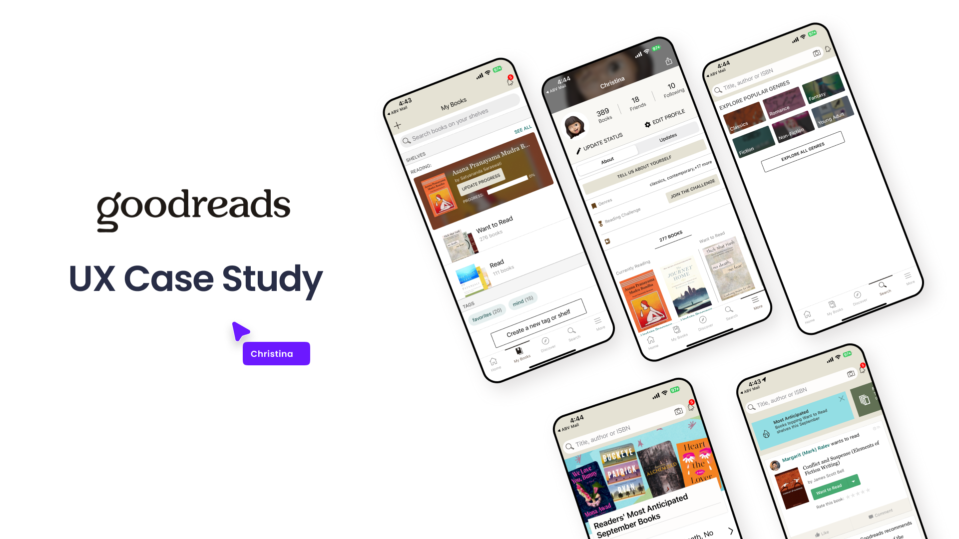
![Graphic showing a UX case study presentation for Goodreads, including multiple mobile phone screens displaying different views of the Goodreads app interface, with a title and a label indicating it's a UX case study.]()
Goodreads
Case Study | UX | Research | Wireframes
-
![]()
Hiker
Bulgarian Hiking App
-
![]()
Conversion Landing Page
Redesign | Research | Web & App