10 UX lessons I learned from designing a mental health app

Designing for mental health isn’t just about creating usable interfaces – it’s about creating experiences that support, comfort, and guide people through difficult moments. I had the opportunity to work on Sentur Recovery, an AI-driven mental health companion, and here are 10 lessons I learned along the way.
1️⃣ Trust is the foundation
Users in recovery need to feel safe. Every button, interaction, and color choice communicates reliability. Even small missteps in UI can undermine confidence.
2️⃣ Simplicity reduces cognitive load
Mental health experiences can be overwhelming. Clear flows, minimal options, and hierarchy help users focus on their healing rather than the interface.
3️⃣ Microcopy conveys empathy
The words we use matter. A message like “You’re doing great” can reassure users in ways visual design alone cannot.
4️⃣ Colors and visual tone affect emotions
A calming palette and subtle contrasts help users feel grounded. Brightness, saturation, and hue all influence comfort and perceived safety.
5️⃣ Consistency builds comfort
Predictable patterns, spacing, and iconography reduce uncertainty and help users navigate confidently.
6️⃣ Accessibility equals inclusivity
Design must account for diverse cognitive, visual, and emotional needs. Accessibility is an act of empathy.
7️⃣ Visual hierarchy guides the journey
Key actions and information should always be immediately clear. This ensures users stay on track in their recovery journey.
8️⃣ Interaction design influences perception
Animations and feedback signals are small but powerful. Smooth transitions convey reassurance; abrupt ones can feel jarring.
9️⃣ Branding communicates identity and safety
Typography, imagery, and tone reinforce credibility and emotional security. Brand isn’t decoration – it’s part of the user experience.
🔟 Designing for healing is iterative
Recovery is complex. Continuous prototyping, testing, and listening to users ensures the experience supports progress without pressure.
Conclusion
This project reinforced that UX, UI, and branding aren’t just about usability — they can be therapeutic, human-centered, and emotionally supportive. Designing for mental health challenges us to think deeper, act empathetically, and create experiences that truly help people.
What do you think?
I’d love to hear your thoughts – what’s one lesson you’ve learned from designing for sensitive contexts.
Thank you for reading!
If you’re looking for a UX/UI designer for your next project or would like to share your perspective on this topic, I’d love to connect.
Follow me on Medium for more stories.
More Projects
-
![A screenshot of a mental health app dashboard on a computer with a sidebar menu, displaying session updates, goals, challenges, key updates, skills, assessments, and progress in therapeutic concepts. On the left, a mobile phone screen shows a conversation with Sofia, an AI assistant, greeting Michael and asking about his feelings, with a text input field at the bottom.]()
Sentur Recovery
App | Dashboards | Brand Design | Social Media
-
![My Dictionary]()
My Dictionary
App | User Testing | Prototype
-
![Three smartphone screens displaying a mental health and self-care app interface. The screens show various features including a greeting message, journey plans, meditation courses, a network diagram of emotional states, and personalized content related to stress and internalized homophobia.]()
Sentur
App | Research | Brand
-
![Screenshots of a mobile healthcare app showing a doctor search page, appointment scheduling, and a doctor profile for Dr. Maria Ivanova, a heart surgeon.]()
DocFind
App | Research | Prototype
-
![Screenshots of an online banking app in Bulgarian, showing options for withdrawal, deposit, changing PIN, balance inquiry, and others; includes PIN entry, deposit confirmation, and transaction amount input screens.]()
EasyPay
ATM | Animations | Research
-
![Three smartphones displaying different screens of social media and branding content for Sentur, a healthcare company, with a central woman jumping outdoors and text that says "Tailor your approach to each individual's needs."]()
Sentur Recovery Brand
Brand Design | Social Media
-
![Four smartphone screens showing a music or event app interface including login, genre selection, search results with images of concerts, and event details with location map.]()
ConcertHub
App | Research | Prototype
-
![Laptop and smartphone screens displaying Coca-Cola promotional websites, featuring contests, recipes, and product images in a red, black, and white theme.]()
Coke & Meals
App | Web Design | Promo Engine
-
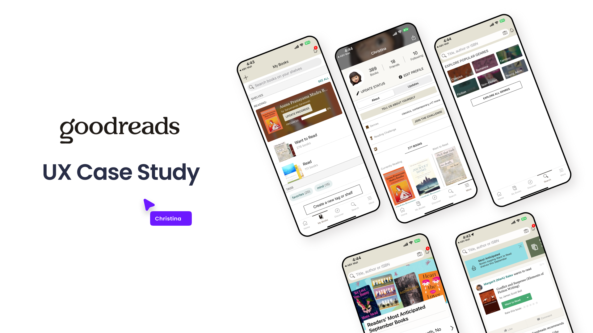
![Graphic showing a UX case study presentation for Goodreads, including multiple mobile phone screens displaying different views of the Goodreads app interface, with a title and a label indicating it's a UX case study.]()
Goodreads
Case Study | UX | Research | Wireframes
-
![]()
Hiker
Bulgarian Hiking App
-
![]()
Conversion Landing Page
Redesign | Research | Web & App