Hiker.bg
UX/UI Redesign Case Study
Project Overview
Project type: Freelance UX/UI redesign
Client: Hiker.bg - a hiking app for mountain trails and huts in Bulgaria
My role: UX/UI Designer
Tools: Figma
My Role
UX/UI Design (end-to-end)
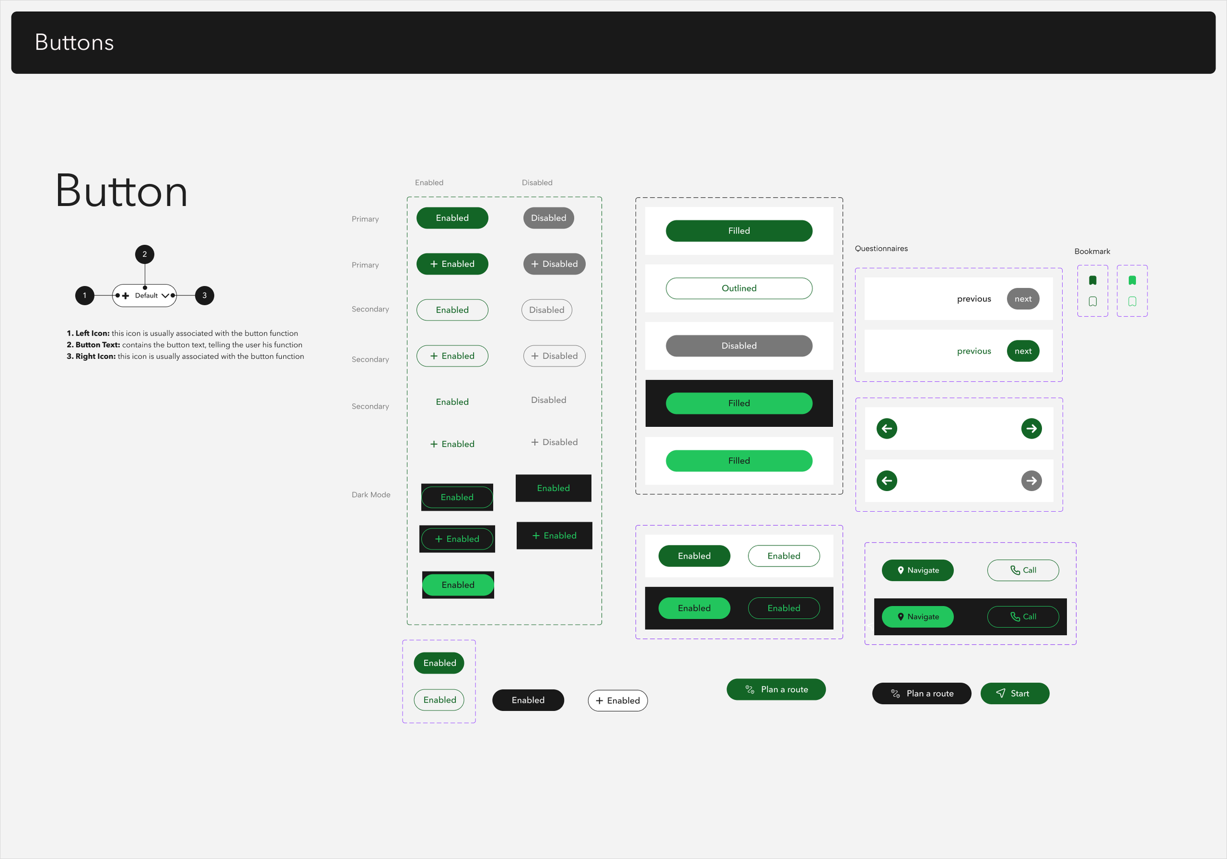
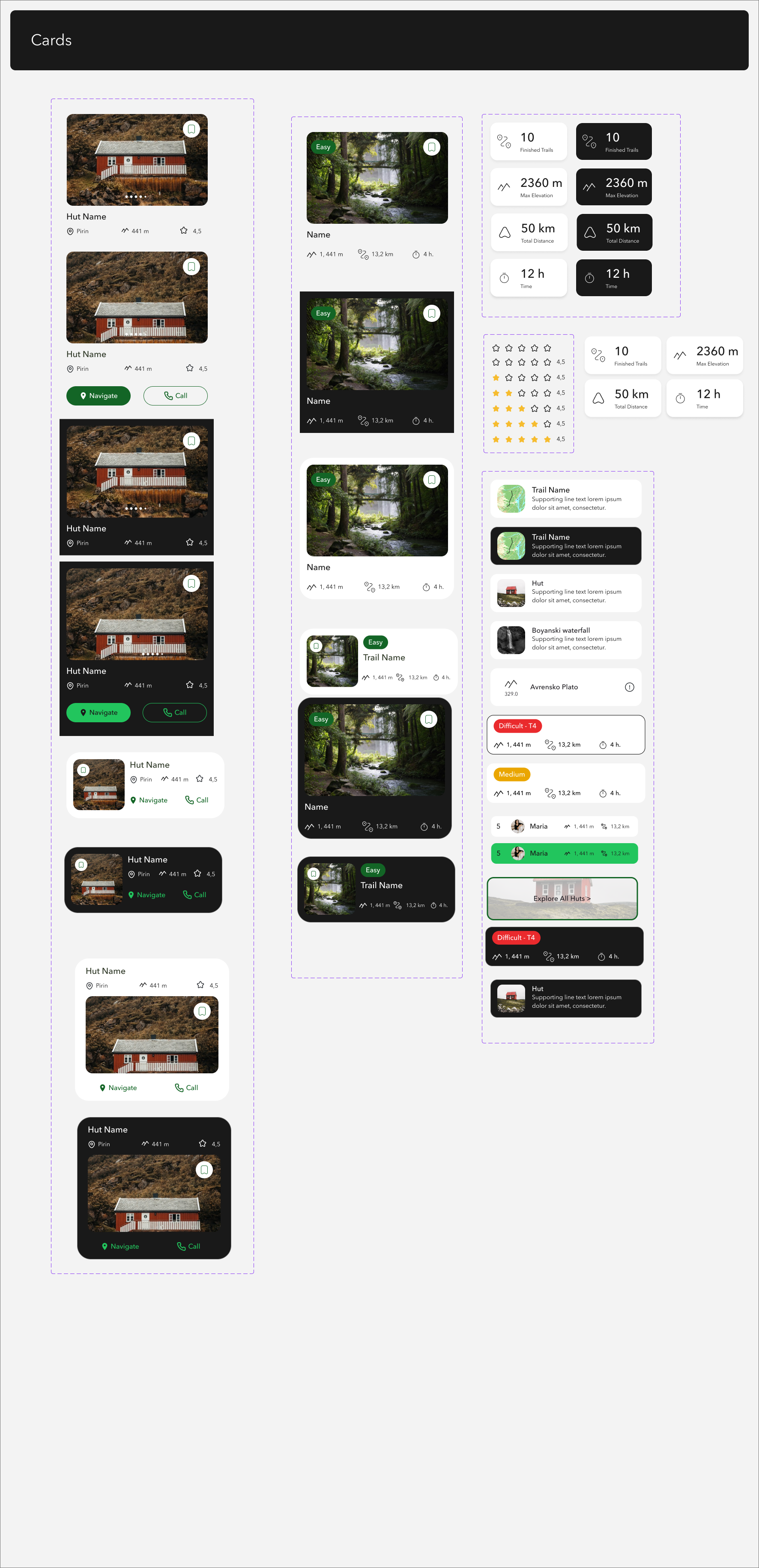
Design systems & components
Journey mapping
High-fidelity wireframes & prototyping
Collaboration with developers for implementation


Goal
improving the usability, navigation, and visual consistency of the app.
introducing new features
creating a desktop version of the app
redesigning the current website.
The Challenge
The current app lacks a clear information structure.
Key features (map tools, routes, and huts) are spread between the map and a hidden side menu.
Inconsistent visual language and outdated UI.
No existing Figma file or design system.
Main tasks
Redesign the experience to make navigation intuitive,
Simplify access to main functions
Create a unified design system for future scalability.
3. Research
Methods:
UX audit of the current app (navigation, visual hierarchy, interactions).
Competitive analysis of similar apps (Komoot, AllTrails, Mapy).
User interviews with 3–5 hikers to understand how they use Hiker and what frustrates them most.
Key insights:
Users rely mostly on the map and want all main features accessible from it.
The side menu feels hidden and confusing.
They need quick access to route planning and danger reporting.
Many open the app mainly to check huts or plan routes before a trip.
Purpose of the User Interviews:
To understand how real users interact with the Hiker.bg app, which features they find useful, and which ones cause difficulties.
The interviews were conducted with 3 participants who actively practice hiking in Bulgaria.
Key Observations
Map and Navigation
Most users spend the majority of their time on the map.
The map rotation (ON/OFF) was unclear.
Users tried tapping icons on the map expecting more information.
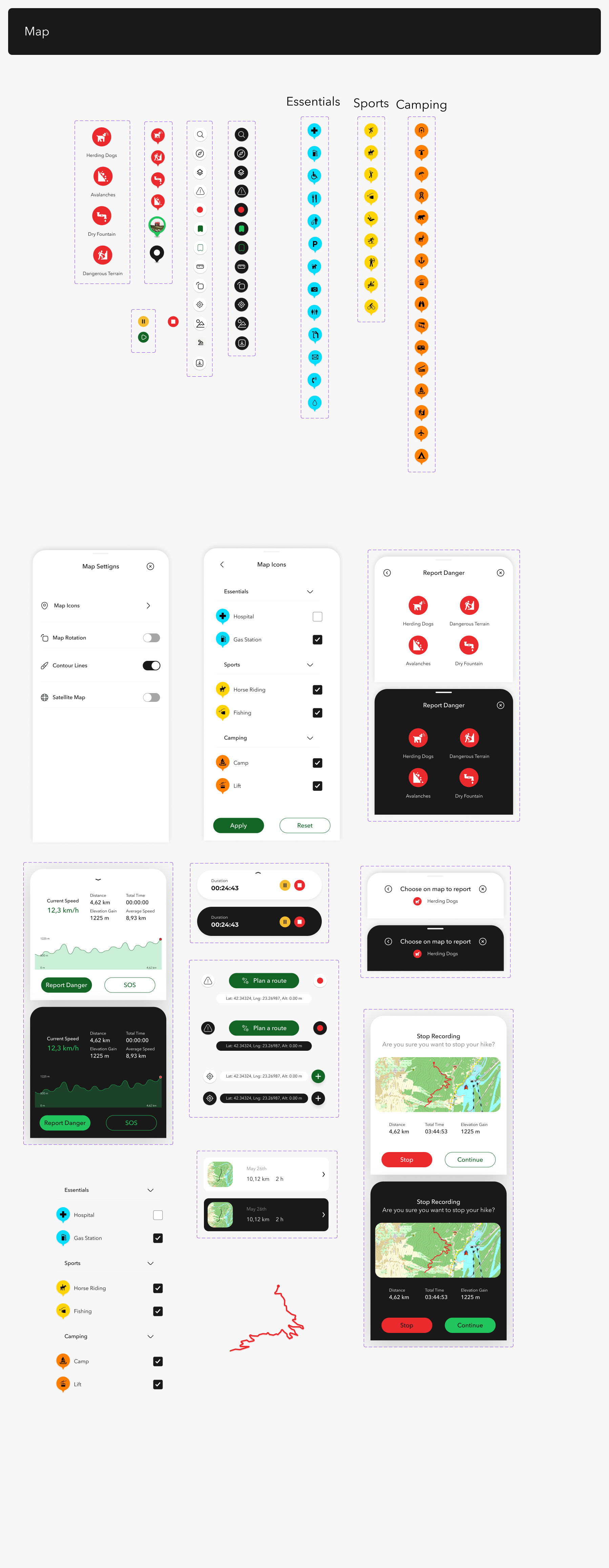
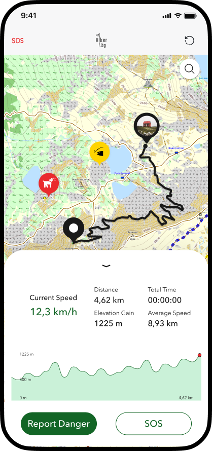
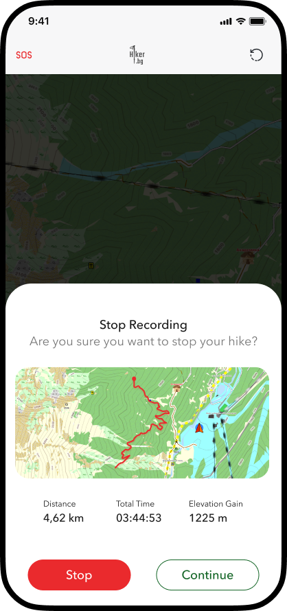
→ Insight: The map should be the main hub, with more intuitive controls and secondary options hidden (e.g., via a bottom sheet).
Routes and Huts
Users had difficulty finding how to create a route, even though it is a core function of the app.
→ Insight: Core app functions should be more visible and easily accessible so users can achieve their goals quickly and intuitively.
Reporting Dangers and SOS
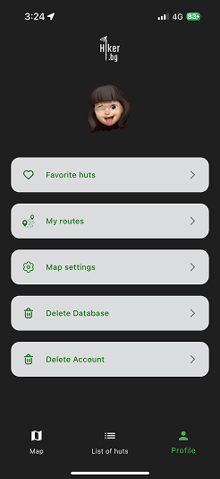
Users were unaware of the “Report Danger” and SOS functions because they are hidden in the menu, even though they are essential.
→ Insight: Safety and SOS functions should have a clearer place in the navigation.
General Impressions
The map interface is cluttered.
Spacing between elements is uneven, making visual perception difficult.
In dark mode, the contrast between background and text is insufficient.
Users are confused about what to do first when entering the app — an onboarding screen or tooltips would help orientation.
→ Insight: The redesign should focus on better readability, visual balance, and a clear initial experience.
Main Takeaways from the Interviews
The map is the core of the user experience.
Users want quick access to routes and huts without leaving the map.
Safety and SOS features are valuable but need to be more visible.
The interface needs visual simplification and clarity.
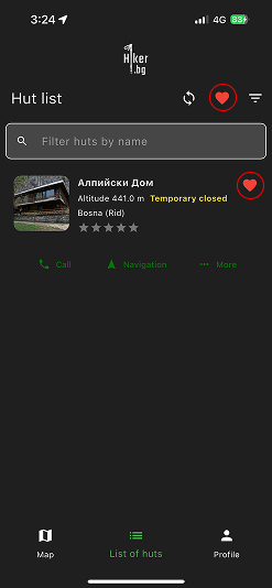
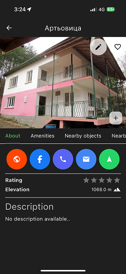
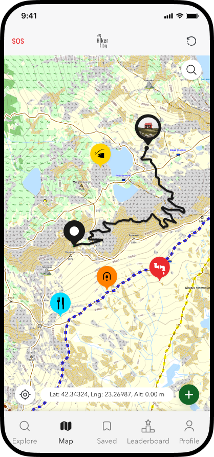
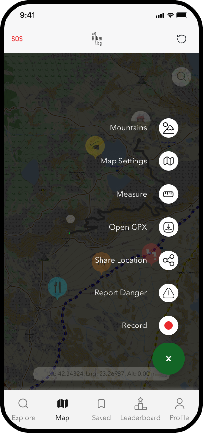
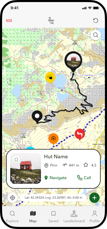
Solutions & Key Improvements
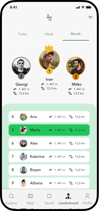
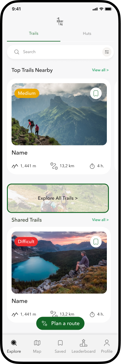
Unified navigation with 5 main tabs - explore, map, leaderboard, saved and profile.
Floating map controls for quick access (route planning, compass, report danger).
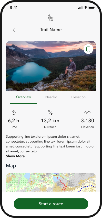
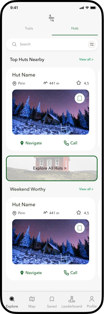
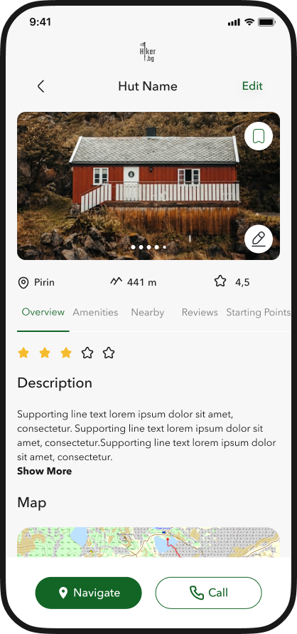
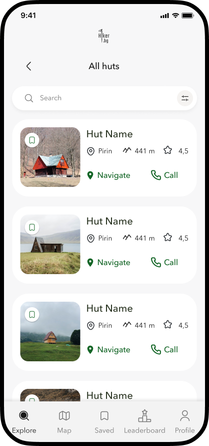
Redesigned “Explore” screen with trails and huts.
New design system for color consistency and accessibility.
Results
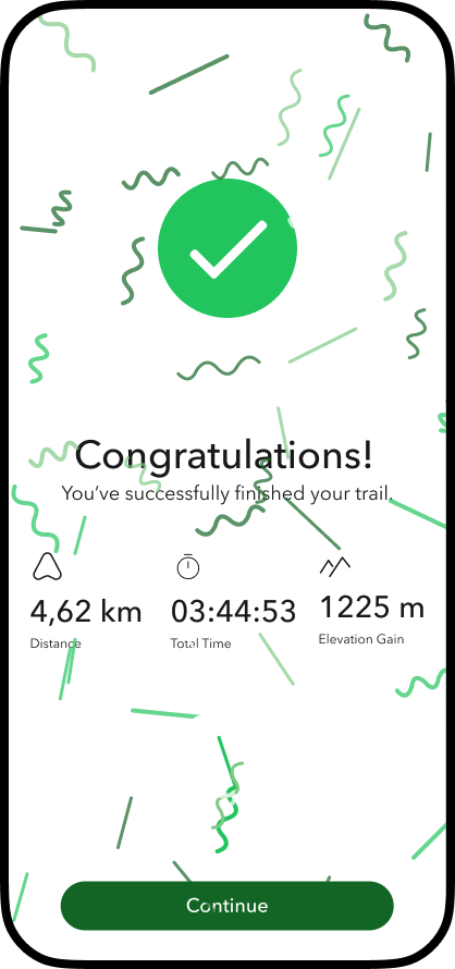
Cleaner structure and reduced cognitive load.
Easier discovery of routes and huts.
Faster access to map tools (within one tap).
Consistent, modern UI ready for future scaling.


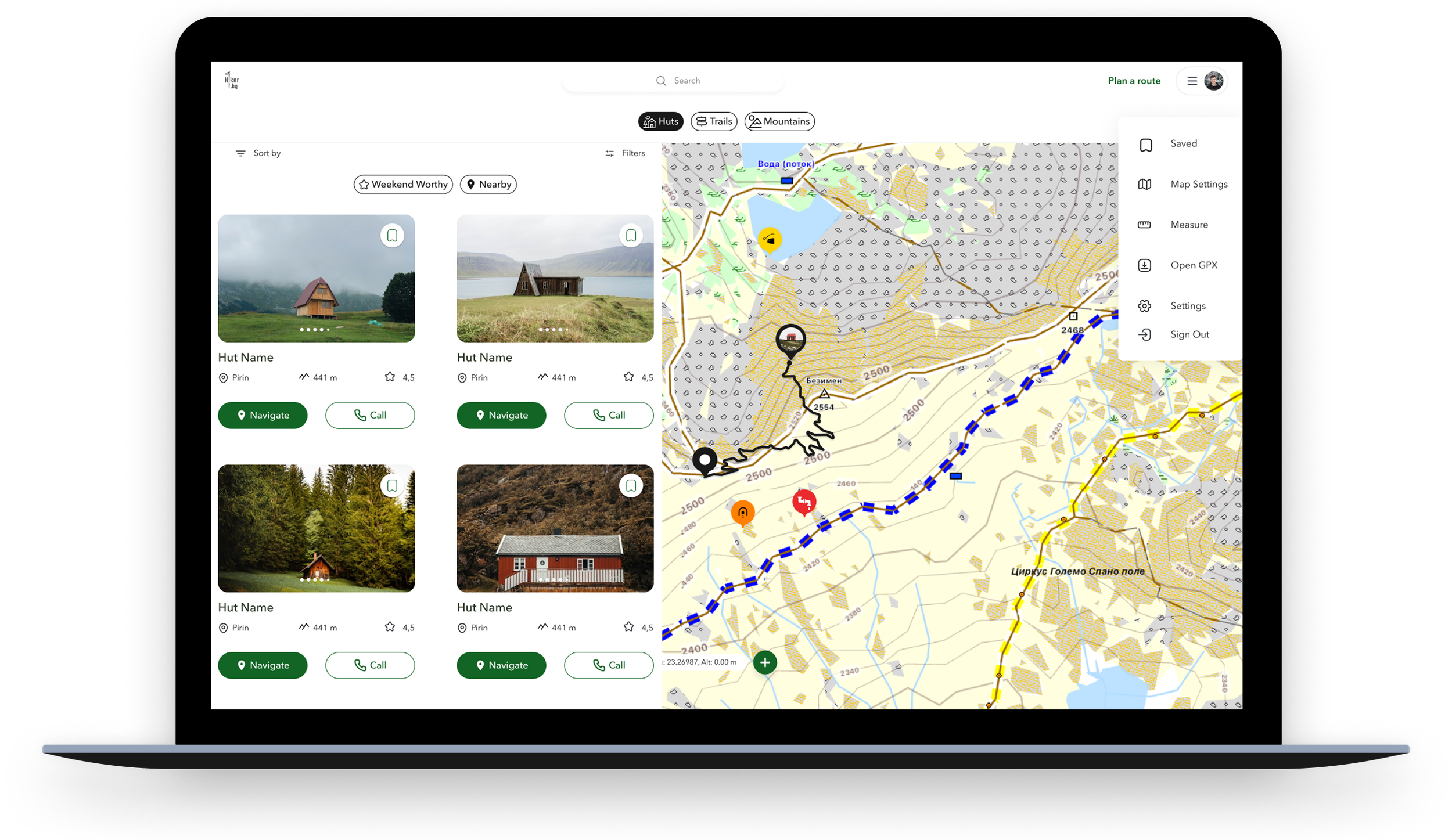
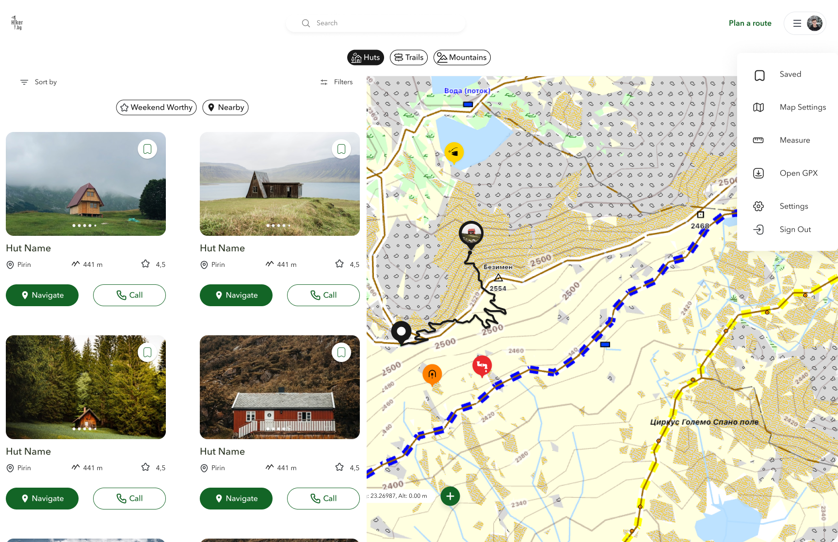
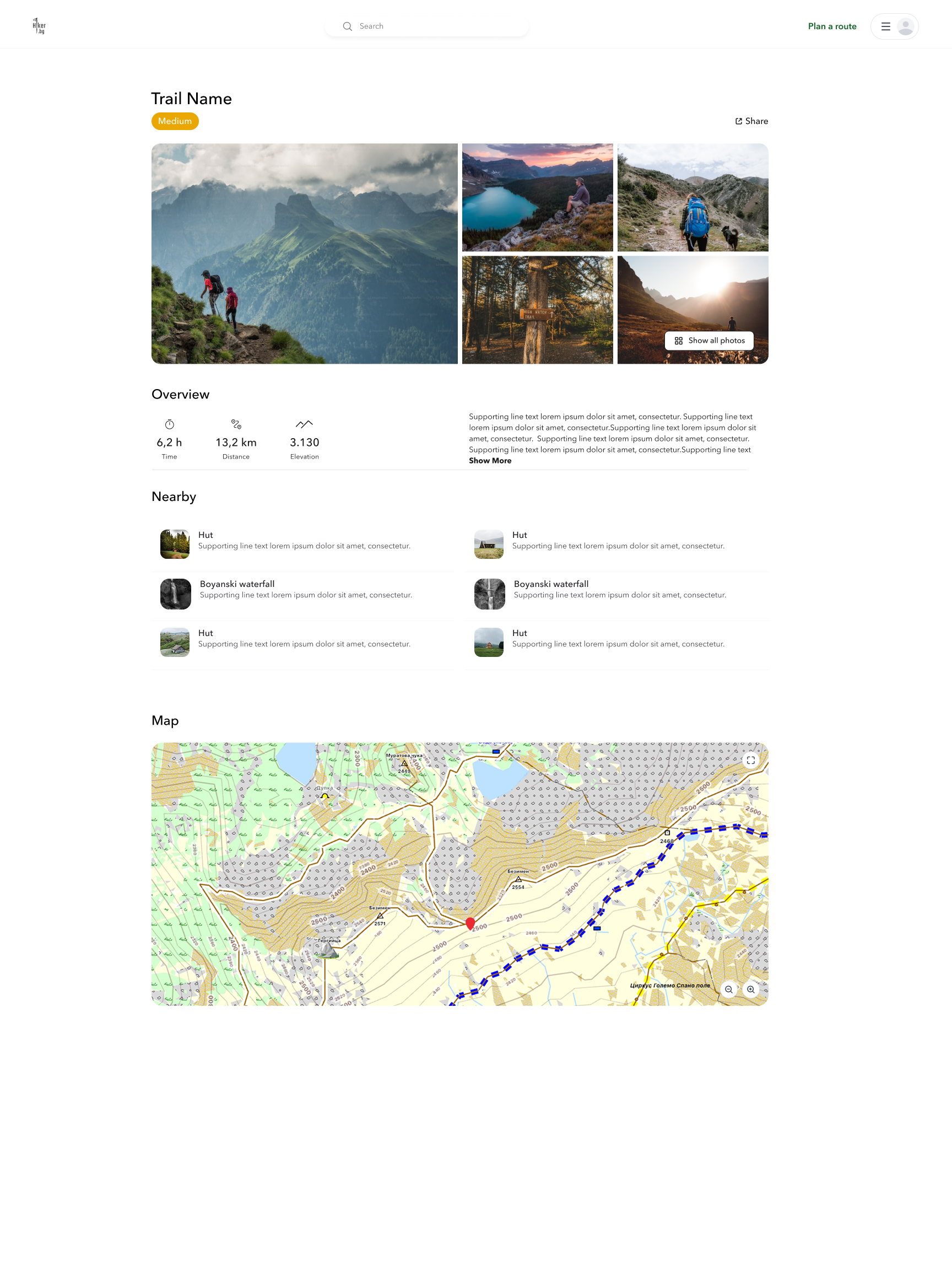
Desktop Version of the map
The desktop version extends the mobile experience for pre-trip planning and deeper analysis. Users can compare routes, explore huts in detail, and review potential hazards - all on a larger interactive map. They can plan a route and save it for later to access it from their phone.


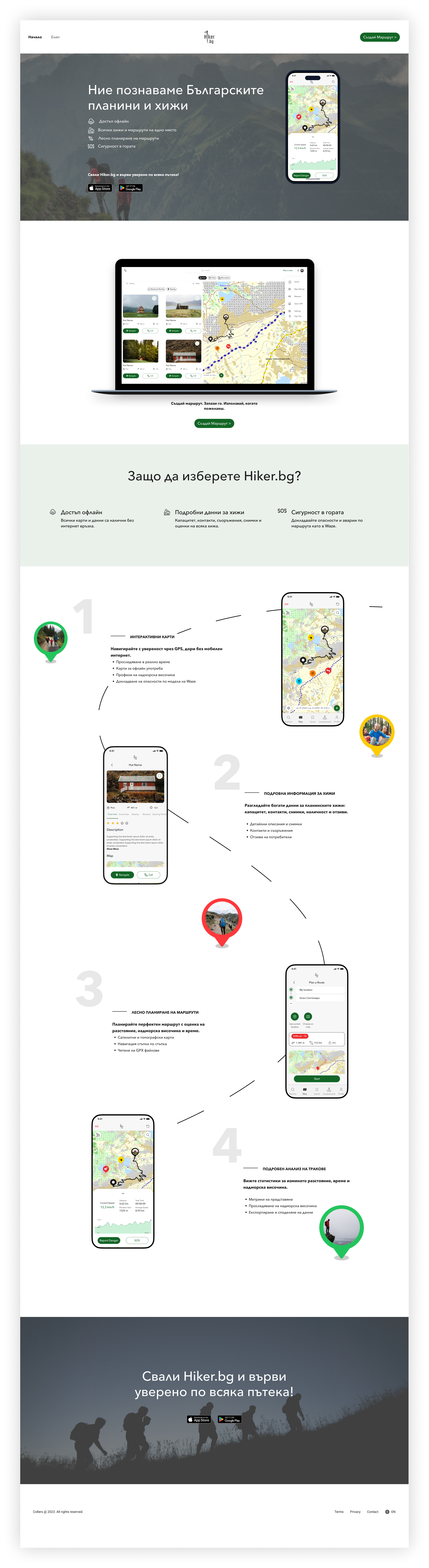
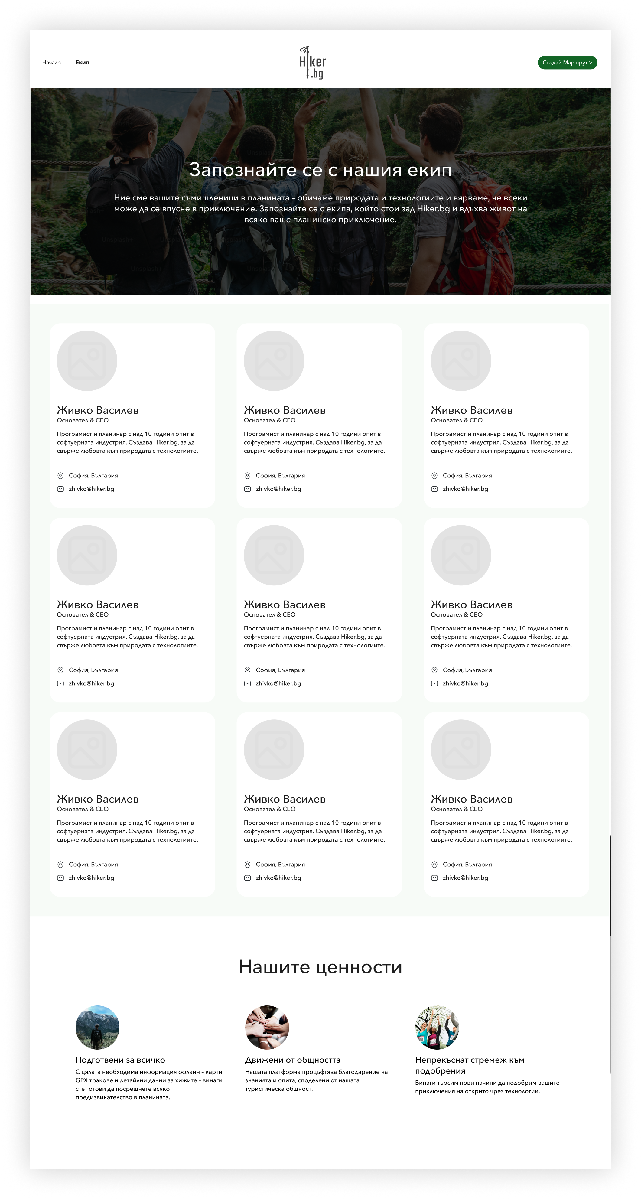
Landing Page
Final Thoughts
User-Centered Approach
“This project reinforced the importance of designing with the user’s context in mind. Every decision, from the map-centered interface to the tag-based filters and always-visible danger icons, was guided by real user needs uncovered through interviews and persona development.”
2️⃣ Simplicity and Clarity
“Keeping the map as the core hub, while allowing users to filter content with tags instead of navigating through multiple tabs, helped reduce cognitive load and create a calm, intuitive experience for hikers. The approach balances information richness with visual simplicity.”
3️⃣ Multi-Platform Thinking
“Designing the desktop version alongside mobile emphasized the importance of task context: mobile for on-trail navigation and desktop for pre-trip planning. This strengthened the project’s flexibility and scalability.”
4️⃣ Safety as a Priority
“Integrating persistent danger icons and quick-access SOS/reporting functions ensures user safety is always visible and easy to act on — a critical feature for outdoor applications.”
5️⃣ Portfolio / UX Learnings
“The project allowed me to combine research, user-centered design, and information architecture to create a cohesive experience. I learned how to translate user insights into a functional map-centered interface, design intuitive filters, and balance simplicity with functionality.”
✅ Optional Closing Statement
“Overall, this project demonstrates a thoughtful UX approach to outdoor adventure apps: clear, safe, and user-focused, while being scalable for future features and multi-platform use.”This wasn’t just a product. It was a shared vision.
A vision for healing that feels human.
A tool that meets people where they are.
A design that honors the complexity of being.
More Projects
-
![A screenshot of a mental health app dashboard on a computer with a sidebar menu, displaying session updates, goals, challenges, key updates, skills, assessments, and progress in therapeutic concepts. On the left, a mobile phone screen shows a conversation with Sofia, an AI assistant, greeting Michael and asking about his feelings, with a text input field at the bottom.]()
Sentur Recovery
App | Dashboards | Brand Design | Social Media
-
![My Dictionary]()
My Dictionary
App | User Testing | Prototype
-
![Three smartphone screens displaying a mental health and self-care app interface. The screens show various features including a greeting message, journey plans, meditation courses, a network diagram of emotional states, and personalized content related to stress and internalized homophobia.]()
Sentur
App | Research | Brand
-
![Screenshots of a mobile healthcare app showing a doctor search page, appointment scheduling, and a doctor profile for Dr. Maria Ivanova, a heart surgeon.]()
DocFind
App | Research | Prototype
-
![Screenshots of an online banking app in Bulgarian, showing options for withdrawal, deposit, changing PIN, balance inquiry, and others; includes PIN entry, deposit confirmation, and transaction amount input screens.]()
EasyPay
ATM | Animations | Research
-
![Three smartphones displaying different screens of social media and branding content for Sentur, a healthcare company, with a central woman jumping outdoors and text that says "Tailor your approach to each individual's needs."]()
Sentur Recovery Brand
Brand Design | Social Media
-
![Four smartphone screens showing a music or event app interface including login, genre selection, search results with images of concerts, and event details with location map.]()
ConcertHub
App | Research | Prototype
-
![Laptop and smartphone screens displaying Coca-Cola promotional websites, featuring contests, recipes, and product images in a red, black, and white theme.]()
Coke & Meals
App | Web Design | Promo Engine
-
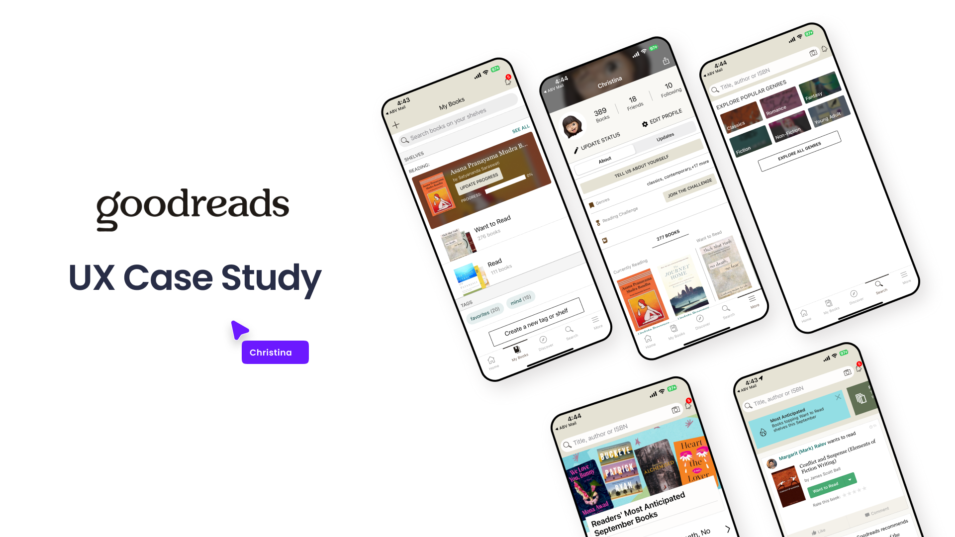
![Graphic showing a UX case study presentation for Goodreads, including multiple mobile phone screens displaying different views of the Goodreads app interface, with a title and a label indicating it's a UX case study.]()
Goodreads
Case Study | UX | Research | Wireframes