Hiker.bg
UX/UI Redesign Case Study
Project Overview
Project type: Freelance UX/UI redesign
Client: Hiker.bg - a hiking app for mountain trails and huts in Bulgaria
My role: UX/UI Designer
Tools: Figma
My Role
UX/UI Design (end-to-end)
Design systems & components
Journey mapping
High-fidelity wireframes & prototyping
Collaboration with developers for implementation
Goal
improving the usability, navigation, and visual consistency of the app.
introducing new features
creating a desktop version of the app
redesigning the current website.
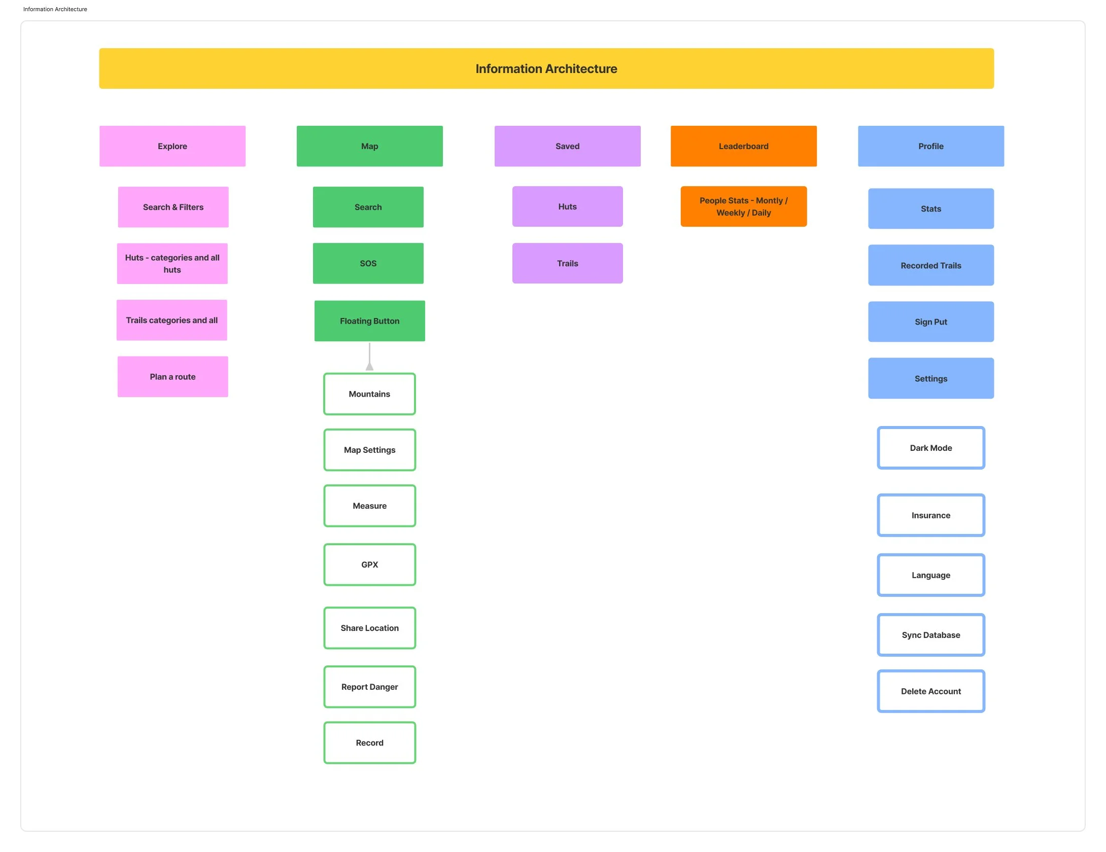
The Challenge
The current app lacks a clear information structure.
Key features (map tools, routes, and huts) are spread between the map and a hidden side menu.
Inconsistent visual language and outdated UI.
No existing Figma file or design system.
Main tasks
Redesign the experience to make navigation intuitive,
Simplify access to main functions
Create a unified design system for future scalability.
3. Research
Methods:
UX audit of the current app (navigation, visual hierarchy, interactions).
Competitive analysis of similar apps (Komoot, AllTrails, Mapy).
User interviews with 3–5 hikers to understand how they use Hiker and what frustrates them most.
Key insights:
Users rely mostly on the map and want all main features accessible from it.
The side menu feels hidden and confusing.
They need quick access to route planning and danger reporting.
Many open the app mainly to check huts or plan routes before a trip.
Design System & Brand Guidelines:
I created a calming, minimalistic visual identity to reflect the therapeutic nature of the platform. Colors, typography, and layout choices were made to reduce cognitive load, support emotional regulation, and create a sense of trust and warmth. The brand needed to feel clinical but compassionate.


Consistency Across Platforms:
Both the app and dashboard share a cohesive design language to reinforce brand identity and reduce learning curves between tools. This helps facilities onboard new users more easily while maintaining a high level of trust and professionalism.


App Design
The design of Sentur focused on creating a safe, soothing space for inner work. I led the UI/UX design of the mobile app, where patients engage in parts-based self-reflection and emotional check-ins. Every detail was intentional—from the color palette to the gentle animations and conversational tone.
Why I Designed It This Way:
Emotional Safety First: Users come to Sentur in vulnerable moments. I used soft typography, spacious layouts, and calming visuals to reduce overwhelm and invite trust.
Guided Healing: The app needed to feel like a companion, not a tool. I crafted conversational flows and iconography that guide users through complex emotional territory without feeling clinical.
Personalization: Patients see reflections tailored to their own emotional journey. I designed dynamic interfaces that adapt based on user inputs—creating space for real growth.
Consistency with Brand: I created the design system and visual guidelines to ensure that every interaction—across mobile and desktop—feels coherent and grounded in the same philosophy.
My goal was to help users feel held—not just seen. Every screen is designed to mirror back inner clarity.


Dashboard for Clinicians:
The dashboard was designed to surface key patient insights quickly. I prioritized clarity and efficiency—giving clinicians at-a-glance access to check-in data, safety alerts, and therapy milestones. This helps them better prepare for sessions, spot concerning trends, and focus more on care, less on admin.


Final Thoughts
Designing Sentur Recovery was more than creating an app—it was about building a space where healing can begin. This project brought together my passion for emotional wellbeing, thoughtful storytelling, and intentional design.
Working closely with developers and therapists, I translated deep therapeutic principles into an experience that feels personal, safe, and empowering—for both patients and practitioners. From user journeys to brand direction, every decision was rooted in clarity, compassion, and care.
This wasn’t just a product. It was a shared vision.
A vision for healing that feels human.
A tool that meets people where they are.
A design that honors the complexity of being.
More Projects
-
![A screenshot of a mental health app dashboard on a computer with a sidebar menu, displaying session updates, goals, challenges, key updates, skills, assessments, and progress in therapeutic concepts. On the left, a mobile phone screen shows a conversation with Sofia, an AI assistant, greeting Michael and asking about his feelings, with a text input field at the bottom.]()
Sentur Recovery
App | Dashboards | Brand Design | Social Media
-
![My Dictionary]()
My Dictionary
App | User Testing | Prototype
-
![Three smartphone screens displaying a mental health and self-care app interface. The screens show various features including a greeting message, journey plans, meditation courses, a network diagram of emotional states, and personalized content related to stress and internalized homophobia.]()
Sentur
App | Research | Brand
-
![Screenshots of a mobile healthcare app showing a doctor search page, appointment scheduling, and a doctor profile for Dr. Maria Ivanova, a heart surgeon.]()
DocFind
App | Research | Prototype
-
![Screenshots of an online banking app in Bulgarian, showing options for withdrawal, deposit, changing PIN, balance inquiry, and others; includes PIN entry, deposit confirmation, and transaction amount input screens.]()
EasyPay
ATM | Animations | Research
-
![Three smartphones displaying different screens of social media and branding content for Sentur, a healthcare company, with a central woman jumping outdoors and text that says "Tailor your approach to each individual's needs."]()
Sentur Recovery Brand
Brand Design | Social Media
-
![Four smartphone screens showing a music or event app interface including login, genre selection, search results with images of concerts, and event details with location map.]()
ConcertHub
App | Research | Prototype
-
![Laptop and smartphone screens displaying Coca-Cola promotional websites, featuring contests, recipes, and product images in a red, black, and white theme.]()
Coke & Meals
App | Web Design | Promo Engine
-
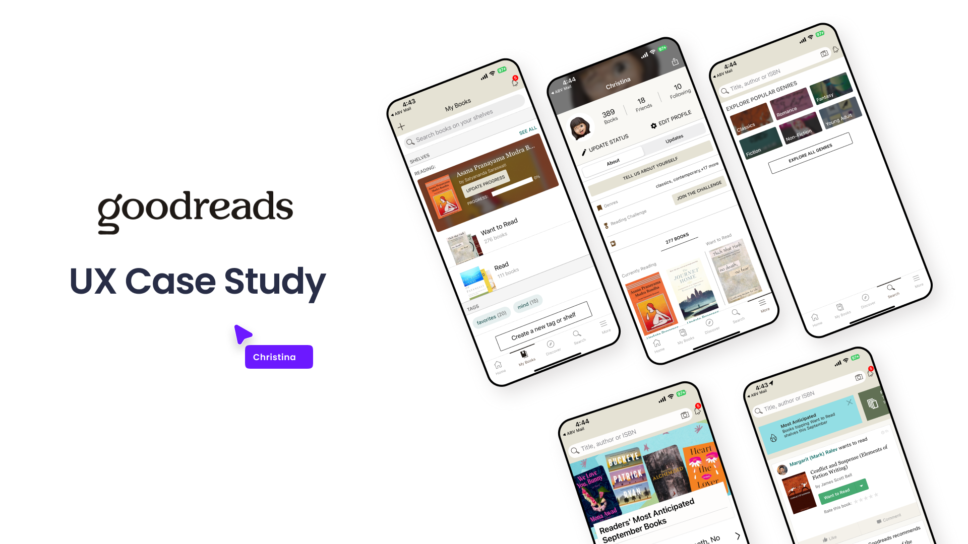
![Graphic showing a UX case study presentation for Goodreads, including multiple mobile phone screens displaying different views of the Goodreads app interface, with a title and a label indicating it's a UX case study.]()
Goodreads
Case Study | UX | Research | Wireframes